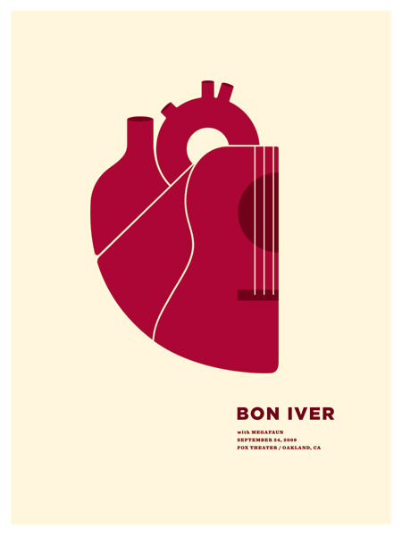
 by oakland-based small stakes of course. i was at this show and this is not becoming a bon iver fan blog, just a coincidence that there have been 2 bon iver related posts lately. not quite sure why I didn’t purchase it. i do remember seeing it from afar, loving the simplicity of the heart illustration (i’m a sucker for heart drawings/diagrams etc., even though they are on the verge of cliche-dom as they are now found on everything from dish towels to t-shirts to coasters) then thinking because it had a guitar built into it, it was a little too “on the nose”….but after seeing it again i thought it was worth a post…even though there is no shortage of amazing gig posters. i love how the lines on the heart feel like broken strings…not sure if it was intended that way, but it works for me.
interesting tid bit…i was reading an article on pitchfork with volcano choir, justin vernon of bon iver’s side project and when asked “One Popular Band I Would Like to See Fall Into Obscurity”, Vernon answered: “bon iver. the sooner the better.” sounds like he has a bit of the cobain popularity complex.








![i-heart-NY_outlines-[Converted]](https://thsdy.files.wordpress.com/2009/11/i-heart-ny_outlines-converted.jpg?w=500&h=649)
